


project proposal.
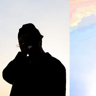
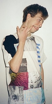
For the final photography project, I’m going to be doing a scrap book or collage based on one of my favourite albums, Welcome Home by Aries. I originally toyed around with the idea of doing a similar thing with my favourite album, Disgrace by Josh A, but Welcome Home gives me so much creative liberty with its sound, broad themes, emotions and aesthetic. I’m going to try and do at least one or two photos that represent each song from the nine song track list. Inspired by the editing for his music videos, I’m going to have the photos surrounded by simple little graphics (mainly pixel based) to stitch the images together, that are representative of the songs themes. The pixel aesthetics also reinforce the odd nostalgic edge this album gives off. I’ll also do this if I decide to go for a scrapbook presentation instead, just little graphics and slight edits to reinforce aesthetics, and single or double page spreads will be used for each song. I enjoyed the documentary photography mini project, where I captured images of people in their rooms, as a bedroom can say so much about a person. I’m going to be using that idea a little bit, but play around with it and make it less documentary and more conceptual with more extravagant and done up sets. My main application of this will be for the song Racecar, to show the subject bored in an office space, off the lyric “She said I hate my dayjob I don’t feel it”
I’ll have the lyrics scribbled around the photos, the lyrics that are relevant at least. The themes of this record are missing people, letting go, greed, loss, disatisfaction, alcoholism and substance abuse, childhood and repetition, carelessness, anxiety and depression. This project is like making single art, having one image represents a song on the covers of singles, before the album goes out. This album covers a lot of topics and themes and sonically has a nice aesthetic to it, and I think my idea for making a book / collage about it is a pretty interesting and fresh concept. The photos are essentially single art.

[welcome]
H
O
M
e.
research.
When initiating my research, I jumped straight to Aries' music videos. These videos are going to be the main inspiration for my photographs. There are so many interesting ideas packed into these videos.
I screen shotted some of the shots I found the most inspiring, and thought of how they could inspire my photos and how I could incorporate the ideas.
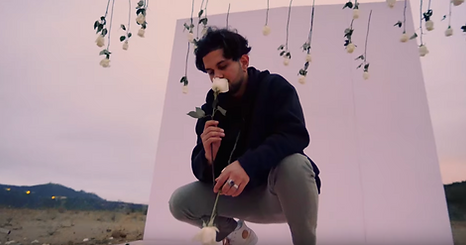
I really like this frame as I find the set so interesting. The plain block color back ground complimented by the sky of a similar tone, with the flowers hanging down. It just looks so pleasing. I thought of replicating this in the photo shoot for BAD NEWS. However, I wanted to have two different colors, and have a guy and a girl standing in front of them. The song is about letting go, so maybe having the two looking the other way standing in the different colors would be effective. But, the narrative of the song suggests he's not fully ready to move on, so we could have him reaching into the other colour and use some sort of effect to have some visual flare.

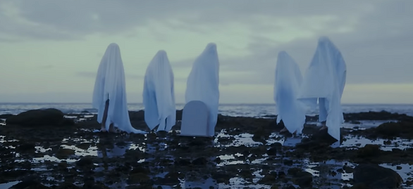
This frame from the AMY'S GRAVE music video is just absolutely beautiful. Though a beach is unlikely, I'd love to recreate this image.


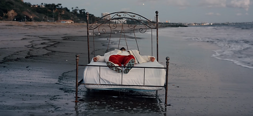
As a 17 year old with limited resources, setups like these are obviously unrealistic for me to achieve, but these are the kinds of sets I want. These whacky, super unrealistic sets, meshing two separate locations, for instance, a bedroom and a beach.

edit reference. I think the effects are cool and I hope to reflect some of it in my work.
I saved these snapshots purely for aesthetic and

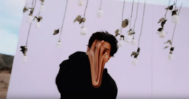
Continuing in my research, I looked at another artist I like, JPEGMAFIA, and found that on the soundcloud version of his newest LP, almost every song has custom artwork.
☭☭☭☭☭☭☭☭☭☭☭☭☭☭☭☭☭☭☭
also he's a communist so he gets bonus points ☭☭☭☭☭☭☭☭☭☭☭

[capitalism_blows_dude.jpg]


Beta Male Stratergies All My Heroes Are Cornballs Jesus Forgive Me, I Am A Thot Post Verified Lifestyle PTSD
There's not really any inspiration I till take from this photo series apart from photo composition and little edit ideas though. The pictures are too grimy (waifu) and realistic, and for my project I want things to look almost fantasy like. Past the glitch hop aesthetic presented in All My Heroes Are Cornballs, this photo series is made for a grim but unfortunately thematically realistic album.
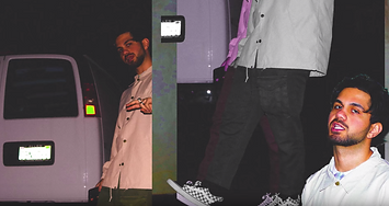
FRANK LEBON 📷


I couldn't find much information on Frank himself, but from what I've gathered, he is a British film maker and photographer. He is becoming very big now, finding himself directing music videos for the likes of A$AP ROCKY.
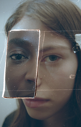
Frank plays a lot with picture in picture
photo editing, which is something I'm looking to use. I was going to use it sparingly and very basically, but upon seeing these photos I've been inspired to play with it more experimentally. For example I really like this photo on the right, how the eyes edited on top
are looking in the different direction of the base image, or how in the image on the left, the girls right eye is that of a black lady. Like in the JPEGMAFIA photo series though, his photos are very gritty and realistic, so past editing, I can't take much inspiration from him.


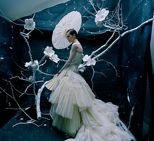
TIM WALKER 📷


Walker is another British photographer who mainly shoots models and fashion. His use of colours is quite fantastic, everything pops so much, and I really hope to replicate these looks. I won't have much access to lights
but I'm hoping playing with camera
settings and photo editing, I can have colours pop as gorgeous as this. Tim has recently expanded into film making, I had a peak at it, but there isn't much I could take to use in my own work, nothing worthy of note for this project at least.

H
O
M
e
i'm
tonight,
been waiting up.


one thousand miles
of chasing you.
planning.
I finally settled on making a photo book rather than a collage print, so I started drawing up my photo ideas, and how I would arrange the pictures on the pages, sticking to my one or two pages per song concept.
On the scans are little notes explaining my thought process behind the photos, and what they represent. As it sits, there's not much from sketch to photo that I will change, of course I am yet to do a bit of test shooting for the project to see if anything I want to do doesn't work.


BAD NEWS + SAYONARA


deity
amy's grave
I decided just to alleviate stress, that I would cut the girl, and draw her in to the pictures instead. It also makes for a good aesthetic, and I was going to draw in the gravestone for AMY'S GRAVE, and it plays into the idea of letting go, so really it all works out
--------------------------------------------------------------------------------------------------------- okay.
so it's now the 28th of January, and due to my job and people being busy and the fact this course has been paced in such a way it's near impossible to make a documentary and a whole photo book in 2 weeks, I'm scaling back this project quite a bit.
I'm now going to be making a small booklet which will follow the following format:
bad news
sayonara
deity
amy's grave
the final product.
evaluation.
Overall, I'm really happy with how the project turned out, even though it didn't pan out I sought it to be from the beginning. The reason it went a bit down hill and I had to downplay the concept was solely because of time. But still, I managed to deliver what I set out to make, a slightly narrative driven, aesthetically pleasing photo book.
Now I am a little upset with how the physical version turned out, but it was completely out of my control it seemed. The PDF i feel looks beautiful, but the final version of the project in physical form feels lazily tacked together in its structure. Me and my teacher for this unit Philippa spent a whole double period and about half an hour after school trying to print out the book, and it never came out right. It would always print with a thick white line dividing double page spreads, and the order would be all over the place. We played with settings all we could, and it worked once, but of course I ruined that with my awful stapling skills. We even printed it again with the same settings as the one that worked, but still to no avail.
Because of this, me and my dad worked together to re arrange, cut out and stick the pages to the backs of each-other using glue sticks, sellotape and razors. I was a bit skeptical doing this, as I thought it would like really rough and unfinished, but it came out pretty well. It's a bit of a shame though, as it takes away from the very clean, digital aesthetic the PDF has. The only purposefully brash looking bits were going to be the drawings.
The drawings I did by drawing them on scrap paper first, and then overlaying them onto the photo book. This was to take place of the female character in the story, to emphasize the themes of loss, distance and death, by having the characters in different styles.
This wasn't the original idea, but I managed to make it work the narrative. I was originally going to cut the female model and narrative, simply to make my shooting sheduling easier to plan, but I figured out a way to make it work with a stylistic edge.
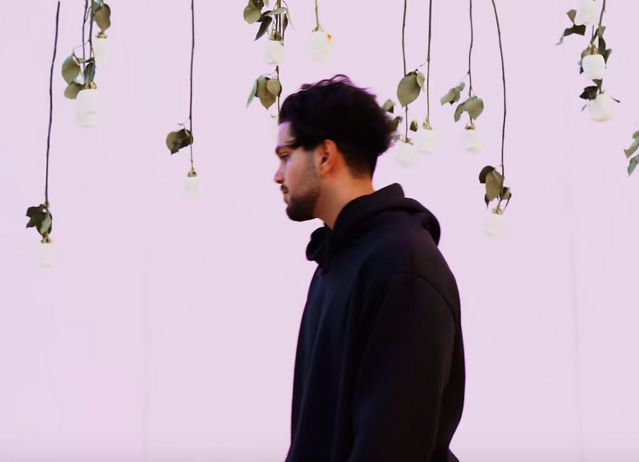
I did the shooting in one day, in South Norwood Country Park, on what I have dubbed "Supernova Hill". I try and work that hill into every one of my projects, as its where I shot a pivotal scene in a few of my first films.
I was originally going to rely on editing to adjust colors, but we got lucky, with a gorgeous sunset making for a lovely backdrop. Here I took four photographs, with my model Alex. I took a selection of photos, which I whittled down to the best ones that fit the project in my eyes.
[UPLOAD A SCAN OF THE CONTACT SHEET!]